

There is no doubt that choosing colors for interior painting is more challenging than it looks. First, there are hundreds and even thousands of colors and shades to choose from. Second, you must consider many factors, such as your room’s space, function, light, and decor. And of course, you have to take in your preference to make the space look yours.
The colors you see on the color swatches from your local paint store can’t convey how they will look once they’re on all four walls of your room at different times of the day. This is why most homeowners end up using neutrals, such as the usual whites and beiges because they are afraid of trying more colorful options for their spaces.
However, you don’t have to shy away from including bold and vibrant shades in your living spaces. If you’re still unsure, it’s best to have Custom Painting, Inc.’s experienced color consultants with you to guide you in choosing the best colors for your home. We serve homeowners through out the Bay area including Danville, Alamo, Blackhawk, Diablo, Livermore, Pleasanton, and San Ramon.
The color psychology
Different colors affect our moods, feelings, and behavior. Color psychology explores how colors can influence our emotional responses. Here’s a quick rundown:
- Warm colors (e.g., red, orange, yellow): These colors can create a sense of warmth and energy, but they might also stimulate or overwhelm if used excessively.
- Cool colors (e.g., blue, green, purple): These colors tend to have a calming and relaxing effect, often making a space feel serene and peaceful.
- Neutral colors (e.g., beige, gray, white): These colors provide a balanced and calming atmosphere, often making it easier to create a cohesive and versatile space.
- Bright colors: Vibrant shades can invigorate and energize a room, while darker hues might make a space feel cozier and more intimate.
Your color choice can impact your mood and the room’s general ambiance, so don’t forget to consider how different shades align with the function and mood you want to create in your space.
Color suggestions for every interior space in your home
While you can tweak the color palette according to necessity or preference, here is the general guide for choosing colors for each of your home’s interior spaces:
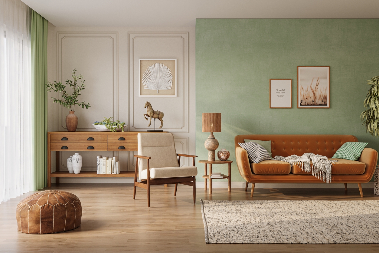
Living room
Palette: Soft Neutrals with a Pop of Color
- Base colors: Light beige, soft gray, or off-white.
- Accent colors: Navy blue, teal, or mustard yellow.
Explanation: Soft neutrals create a warm and inviting atmosphere while making the space feel open and airy. Adding a pop of color through accents (like cushions, rugs, or artwork) provides personality and depth without overwhelming the space.
Bedroom
Palette: Calming blues and greens
- Base colors: Pale blue, soft green, or light gray.
- Accent colors: Deep navy, sage green, or muted gold.
Calming blues and greens are known for their relaxing qualities, making them ideal for a bedroom. They help create a peaceful environment conducive to restful sleep. Accent colors can add a touch of elegance and interest.
Kitchen
Palette: Fresh and energizing
- Base colors: Crisp white, soft gray, or light aqua.
- Accent colors: Bright yellow, shades of red, fresh mint, or vibrant coral.
Fresh and light colors keep the kitchen feeling clean and inviting. Bright accents add energy and make the space feel more dynamic and cheerful, perfect for a room where activity and socializing happen.
Dining area
Palette: Warm and inviting
- Base colors: Soft taupe, warm beige, or gentle cream.
- Accent colors: Rich burgundy, deep olive green, or burnt orange.
Warm, neutral base colors create a cozy and welcoming atmosphere in the dining area, which is ideal for shared meals and gatherings. These shades also provide a versatile backdrop that pairs well with various dining furniture and décor styles.
Bathroom
Palette: Tranquil and refreshing
- Base colors: Soft blue, seafoam green, or light gray.
- Accent colors: White, deep navy, or silver.
Soft, tranquil colors create a relaxing spa-like atmosphere, which is ideal for a bathroom. Adding accents in white or silver can enhance the clean and fresh feeling.
Children’s rooms
Palette: Playful and bright
- Base colors: Light blue, sunny yellow, or soft lavender.
- Accent colors: Bold red, bright green, or vivid orange.
Bright and playful colors stimulate creativity and energy, making them great for children’s rooms. Base colors create a fun and engaging environment, while accents can inject personality and vibrancy.
Home office
Focused and productive
- Base colors: Neutral grays, warm taupe, or soft beige.
- Accent colors: Cool blues, energetic greens, or vibrant oranges.
Neutral base colors provide a calm and uncluttered backdrop that helps maintain focus. Accent colors can energize and motivate, contributing to productivity. Choose accent colors that align with your work style and energy needs.
Feel free to mix and match these palettes based on your personal preferences and the specific needs of each space!
Tips for choosing colors for interior spaces
Choosing colors for interior spaces involves a mix of personal preference and practical considerations. Here are some tips to help you choose the right colors:
- Consider the mood: Factor in the mood you want to create in each room. For example:
- Living rooms and family rooms: Warm, inviting colors like beige, soft browns, or muted greens.
- Bedrooms: Calming colors like soft blues, greens, or neutrals for a restful environment.
- Kitchens and dining areas: Energizing colors like bright yellows, reds, or cool blues to stimulate appetite and conversation.
- Natural light: Observe how natural light affects the color throughout the day. Colors can look different in morning, afternoon, and evening light. Test samples on your walls to see how they change.
- Room size: Light colors can make a room feel larger and more open, while dark colors create a cozy, intimate atmosphere. If you have a small room, consider lighter shades to make it feel more spacious.
- Color harmony: Ensure the colors you choose complement each other and the rest of your home. Use a color wheel or palette tool to find harmonious combinations. For example:
- Analogous colors: Colors next to each other on the color wheel for a harmonious look.
- Complementary colors: Colors opposite each other on the wheel for a vibrant contrast.
- Test samples: Always test paint samples on your walls before committing. Paint large patches to see how the color looks at different times of the day and with various lighting conditions.
- Existing elements: Consider the room’s existing elements, such as flooring, furniture, and artwork. Your color choice should harmonize with these elements.
- Personal preference: Choose colors that you love and feel comfortable with. Your home should reflect your personality and style.
- Color psychology: Be aware of how colors affect your emotions and behavior. For instance:
- Blue: Calming and serene.
- Yellow: Cheerful and uplifting.
- Green: Refreshing and restful.
- Accent walls: If you’re unsure about committing to a bold color, try an accent wall to add a pop of color without overwhelming the space.
- Trends vs. timelessness: Consider whether you want to follow current trends or choose timeless colors. Trends can be fun, but classic colors often have a longer-lasting appeal.
Let our expert team of color consultants and residential painters from Custom Painting Inc. be your guide as you choose the best colors for your interior spaces. For professional assistance, contact Custom Painting, Inc.! If you live in or around Diablo or Pleasanton and surrounding areas, call us at 925-866-9610 or message us here. Our team will help you transform your space expert painting solutions tailored to your needs.
